Color Studies From
Any Photo in minutes.
Plan a color study from any reference photo. Label every swatch in painter language, get a starting mix recipe in the paints you already own, print the whole study for the easel.
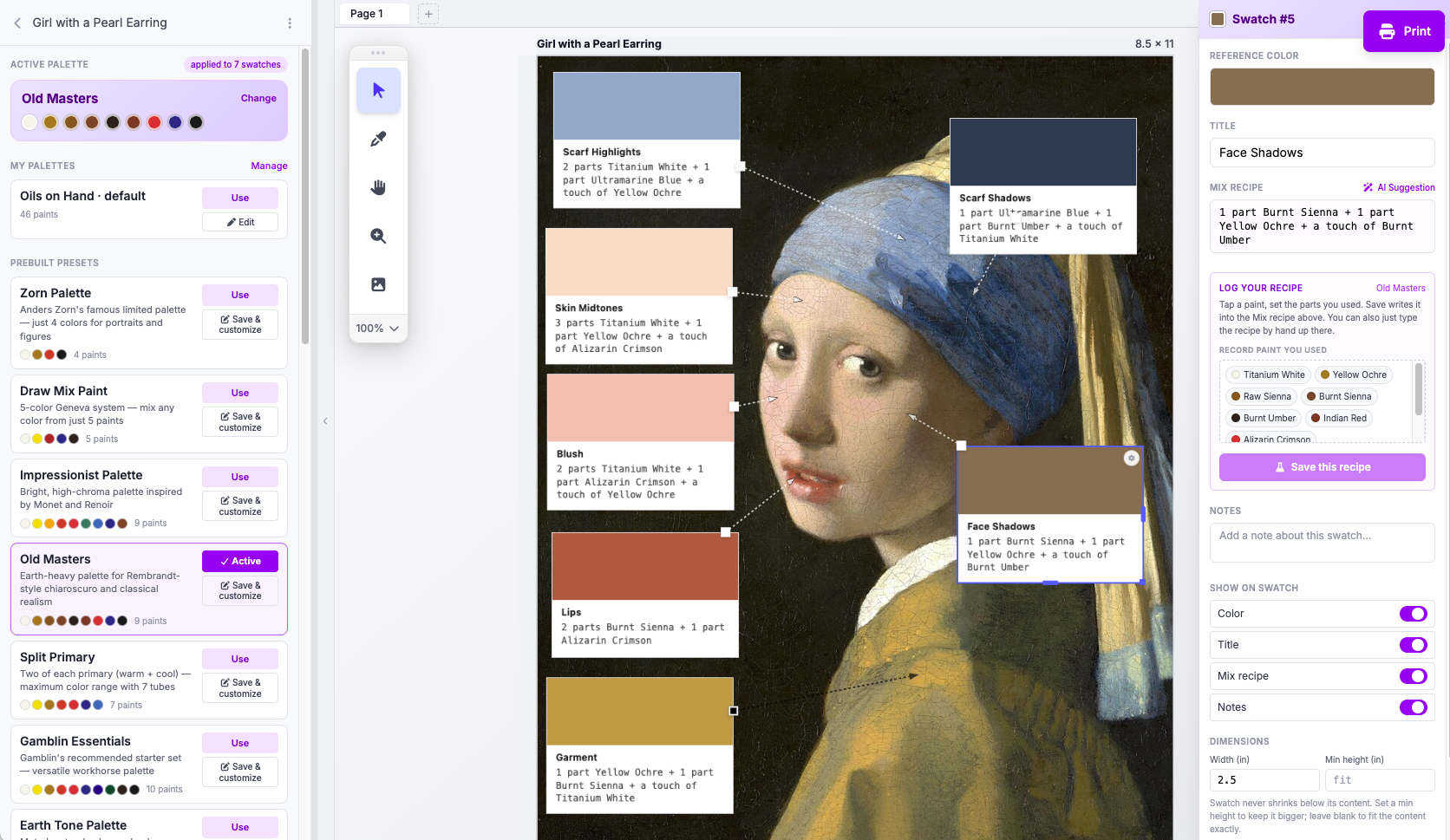
Hours in Photoshop. Minutes here.
Nothing worse than fighting a graphic application when you came to paint and just need a good, remembered study.
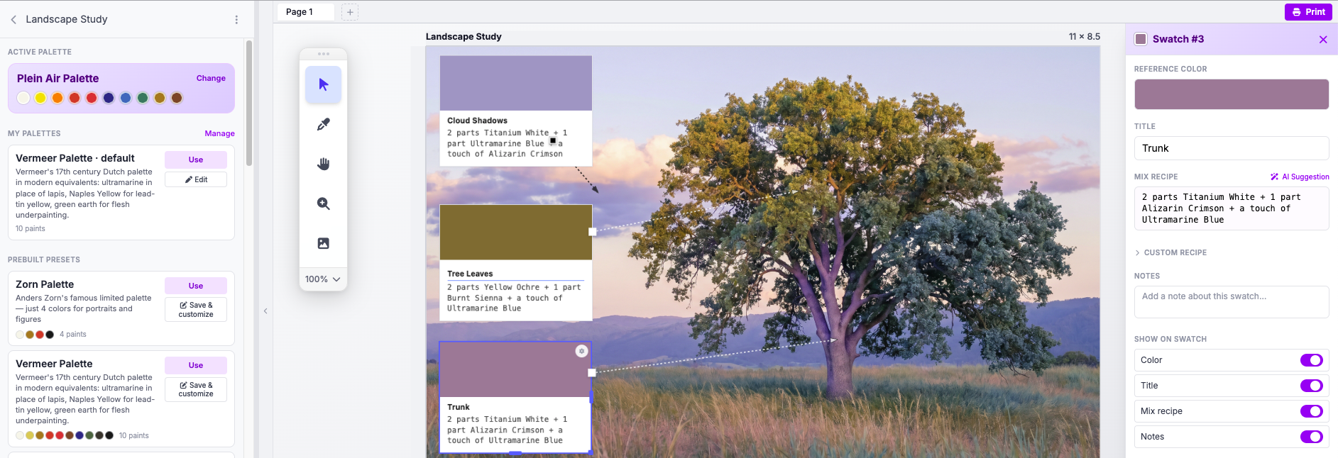
Building a study like the one above in Photoshop, Figma, or Canva is hours of work, even for a seasoned designer. Color-pick every swatch by hand. Type every label. Lay out every mix recipe. Size the print page. Export the PDF.
HueMixy is the design tool already learned, already built for the study you need. So you finish before the studio cools off.
Label every swatch the way you talk at the easel
"Scarf highlights." "Mid shadows." "Face midtones." Click anywhere on your reference, drop a swatch, name it the way you actually describe it when you're painting. A visual line ties each swatch back to the exact spot in the scene.
Not sure what to mix? Let the AI take a crack at it.
Pick the brand on your taboret: Gamblin, Winsor & Newton, Old Holland, M. Graham, Daniel Smith. The starting recipe comes back in the paints already in your palette. "1 part Titanium White, 1 part Cadmium Yellow Light, 1 part Yellow Ochre." You'll be shocked how close it is.
Then you mix at the easel and adjust with your eyes. Save the recipe you actually used. Next time you paint that shadow, the recipe is yours.
Build a palette from the tubes you own
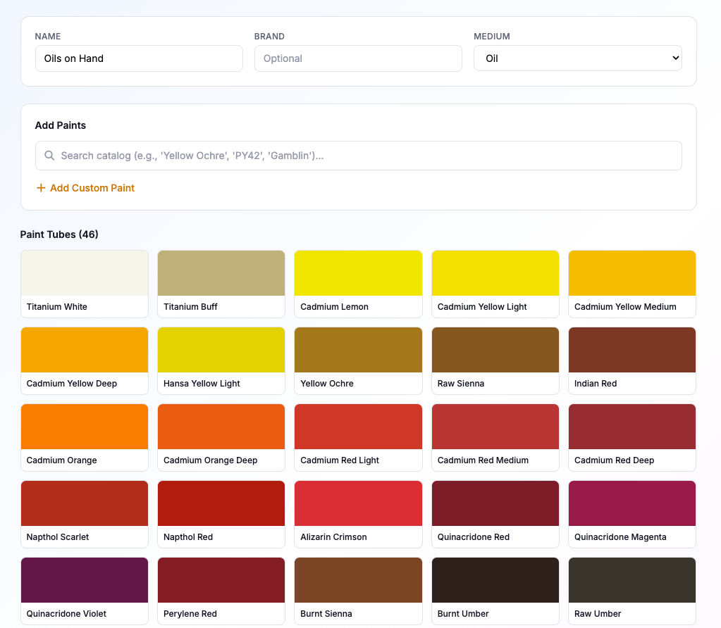
Open a brand catalog, check off the paints actually on your shelf, save it as your working palette. Cadmium Yellow Light, Cadmium Red Medium, Quinacridone Magenta, Ultramarine, Burnt Umber, whatever you reach for. Every recipe HueMixy suggests comes back in your kit.
30+ master palettes.
Step outside your color comfort zone.
Try to mix a blue in the Zorn palette. Zorn has no blue. Just black, white, yellow ochre, and cadmium red light. You make a blue from those four.
That constraint forces a mix you'd never reach for in your own kit. That's where the breakthrough comes from.
Reference for the masters you study. Constraint for color you've never tried. Save any preset, then trim it down to the paints on your shelf.
Tree trunks aren't brown. Leaves aren't pure green.
Most students paint the color they think is there. Tree trunks brown, leaves green, clouds white. The reference says otherwise. Trunks read as warm greys or violet-greys. Leaves shift yellow-green to blue-green with the light. Clouds carry every color in the sky reflected back.
Pick a limited palette (Zorn, a self-imposed three tubes, or just what's on your shelf), sample the swatch you can't quite place, and let HueMixy suggest a starting mix. Often the suggestion alone is enough to land you spot on. The constraint of mixing inside a limited palette teaches what one cadmium plus one ultramarine actually makes. Color theory you learn by doing, not memorizing a wheel.
Workshop instructors: hand every student the same limited palette before the lesson. They mix from the same constraint, you can teach to the result.
Master Painter Palettes, Built In
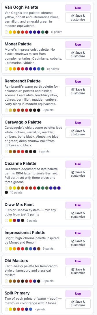
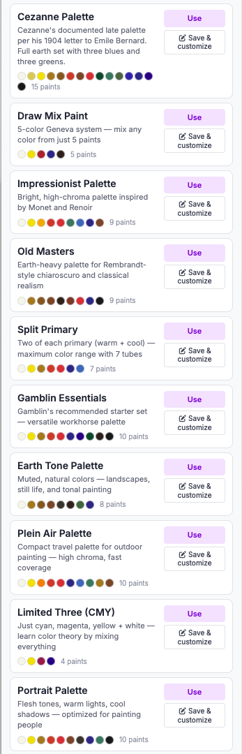
The pigment kits a master actually used, ready to pick as your working palette. Not auto-generated, not approximated. The paints on their taboret, in modern equivalents you can buy today.
- Van Gogh: Chrome yellow, cobalt and ultramarine blues, vermilion, emerald green. The late-period kit.
- Monet: Cadmiums, cobalts, ultramarine, viridian. No black; shadows mixed from complementaries.
- Rembrandt: Lead white, lead-tin yellow, ochres, vermilion, madder, umbers, ivory black. Built for chiaroscuro.
- Vermeer: Naples Yellow, ultramarine (lapis), green earth flesh underpainting. The seventeenth-century Dutch kit.
- Sargent: Earth and cadmium kit for alla prima portrait and figure.
- Sorolla: High-chroma Mediterranean light, cadmiums and viridian.
- Velazquez: Earth-dominated quiet, ochres and umbers around a single warm red.
- Caravaggio: Lead white, ochres, vermilion, madder, umbers, bone black. Almost no blue or green.
- Cezanne: His documented late palette per the 1904 letter to Bernard. Broad: full earth set, three blues, three greens.
- Zorn: Titanium White, Ivory Black, Yellow Ochre, Cadmium Red Light. A complete portrait study in four tubes.
Workshop instructors: build the handout once, hand it to every student. The whole class in the Van Gogh palette before the first brush hits canvas.
Plein Air Color Notes, Off the Camera
Phone snap of a sunset, a tide pool, a passing storm. Drop it in HueMixy when you get back to the studio, sample the colors you wanted to remember, get the mix recipes, print the study. Next plein air session, you've already done the color homework.
Multi-page studies. Dig into the details. Print as one PDF.
The full reference on page one. The eye on page two, zoomed in with its own labeled swatches and recipes. The mouth on page three. Or the same passage tried in a Zorn palette beside a Sargent palette for a side-by-side study. Each page is its own focused study.
Print every page together as a single PDF. Take the whole stack to the easel.
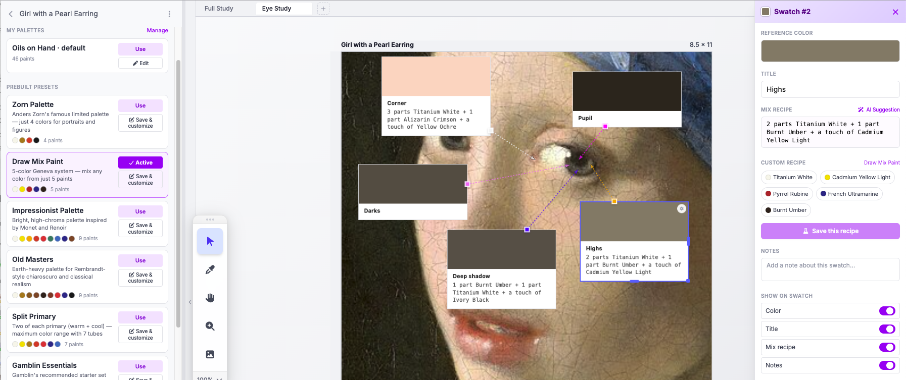
Print it. Tape it. Paint from it.
Letter, tabloid, or wide-format 24 inches and up. Size each swatch with handwriting room. Take the printed study to the easel, mix, jot the recipe you found by hand, type the final mix back in later. The page is the artifact you walk away with.
Free Forever, or $17/year for Unlimited
5 boards free. Pro is $2/month or $17/year for unlimited boards and every palette.